
Colour-Drenching: How to Choose One Hue and Go All In
- James O
- Dec 16, 2025
- 7 min read
In luxury interiors, few trends have made as powerful a statement as colour-drenching. Gone are the days of accent walls and contrasting trims; instead, designers are choosing to envelop entire spaces in a single hue. Walls, ceilings, woodwork, cabinetry, and even furniture come together in one tone, creating an immersive and intentional atmosphere.
At its best, colour-drenching transforms a space from ordinary to architectural. It creates cohesion, depth, and sophistication, allowing the chosen hue to speak with full confidence. But the art lies in execution, and understanding how to balance boldness with restraint. This guide explores how to approach colour-drenching thoughtfully, ensuring every detail contributes to a look that feels as luxurious as it is liveable.
WHAT COLOUR DRENCHING IS AND WHY IT WORKS
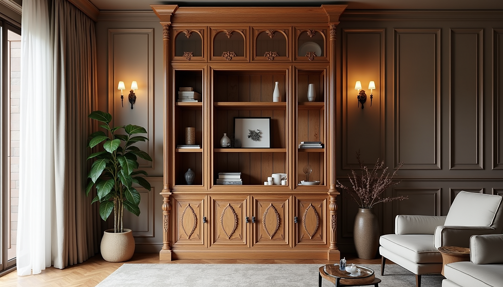
Colour-drenching is the technique of applying a single colour to multiple surfaces within a room — walls, ceilings, doors, skirting boards, radiators, even cabinetry. The effect is a seamless envelope of colour that removes the visual breaks and contrasts that typically define a room.
In luxury design, this approach does more than create uniformity. It produces a sense of calm and continuity, particularly when executed in deep, rich tones or refined neutrals. The absence of abrupt changes lets the architecture take centre stage, highlighting mouldings, curves, and proportions in a sophisticated, understated way.
From a psychological standpoint, colour-drenching creates a cocooning effect. By surrounding the eye with a single hue, the room feels more immersive, and this is perfect for intimate lounges, bedrooms, or studies. Alternatively, in lighter tones, the same technique can make a space feel brighter, larger, and effortlessly modern.
For luxury homes, the real appeal lies in the craftsmanship. When every surface is meticulously finished in the same shade, the result feels bespoke and intentional, the mark of a carefully considered interior rather than a passing trend.
THE BENEFITS OF COLOUR DRENCHING IN LUXURY INTERIORS
Beyond its visual impact, colour-drenching brings a suite of functional and emotional benefits that make it particularly suited to high-end homes.
Creates Visual Harmony: By painting every surface in the same colour, the room gains a sense of unity. This cohesion allows statement furniture, lighting, or artwork to stand out without visual clutter. In large homes, it also provides a rhythm that ties rooms together while keeping each space distinctive.
Highlights Architectural Detail: In luxury homes, intricate mouldings, curved archways, or panelled doors can often compete visually with contrasting trims. Colour-drenching resolves this by covering them in the same hue, allowing the craftsmanship to be appreciated for its form rather than its contrast.
Expands Small or Awkward Spaces: In rooms with irregular shapes or low ceilings, too many contrasting colours can accentuate boundaries. A single shade smooths out the visual geometry, creating a sense of expansiveness and cohesion.
Builds Atmosphere: A fully drenched space can feel dramatic and enveloping or soft and tranquil, depending on the chosen colour. The immersive nature of this design makes it ideal for spaces meant to evoke emotion such as reading rooms, bedrooms, or spa-like bathrooms.
Ultimately, colour-drenching is both design statement and psychological experience. It is a perfect marriage of aesthetic confidence and emotional resonance.

PITFALLS AND WHAT TO AVOID
For all its impact, colour-drenching can go wrong if applied without precision. The difference between luxurious and overpowering lies in the details.
Ignoring the Scale of the Space: In expansive open-plan rooms, drenching every surface in one colour can feel monotonous or overwhelming. It’s essential to break up the space using subtle zoning techniques — rugs, varied lighting, or changes in texture — to ensure visual balance.
Poor Lighting Decisions: Lighting transforms colour dramatically. A hue that feels rich in daylight may turn dull or heavy in artificial light. It’s crucial to test the colour under different lighting conditions before committing. Layered lighting, including wall washers and sconces, can help highlight the tone rather than flatten it.
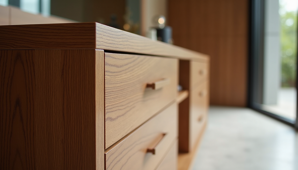
Lack of Texture: A flat matte finish across every surface risks making the space feel lifeless. Variation in finish — for example, matte on walls with semi-gloss on trim or lacquer on cabinetry — adds sophistication and dimension while maintaining cohesion.
Wrong Colour Choice: While bold tones can make a strong statement, not every colour suits large-scale application. Highly saturated hues can quickly become fatiguing. Choosing shades with depth or muted undertones ensures longevity and comfort.
Thoughtful restraint and testing are what separate a designer’s masterpiece from an experiment gone wrong.
HOW TO CHOOSE THE RIGHT HUE AND USE IT SMARTLY
Selecting the right colour for a drenched room is both art and science. The key lies in balancing mood, architecture, and function.
Assess Natural Light: Light affects how colour behaves. North-facing rooms benefit from warmer tones to offset cool light, while south-facing spaces can handle cooler hues without feeling stark. Always test swatches on multiple surfaces and observe how they shift throughout the day.
Consider Room Size and Function: Deep shades like navy, olive, or aubergine work beautifully in intimate rooms such as libraries or dining spaces, creating depth and intimacy. In contrast, soft greys, sandy taupes, and pale greens expand smaller or multifunctional areas, maintaining a sense of calm.
Layer Finishes: The same hue in different finishes can provide balance. Matte walls absorb light and feel soft, while gloss trims and cabinetry reflect it, adding subtle sheen. This layered approach introduces depth and tactility without breaking the colour story.
Double Drenching: For those hesitant about full immersion, double drenching — using two close shades of the same hue — adds variation while maintaining cohesion. For instance, a muted sage on walls paired with a deeper olive on joinery feels rich yet restrained.
Tone and Undertone Awareness: In luxury design, undertones are everything. A beige with pink undertones feels warmer than one with grey, and the difference can alter the entire mood of a room. Always compare swatches under both daylight and artificial lighting before making a final choice.
A successful drench is one that feels natural to the space. It is an enhancement, not an imposition.
IMPLEMENTATION AND EXECUTION
Executing colour-drenching in a luxury home requires craftsmanship and foresight. Every detail, from surface preparation to paint finish, contributes to the final result.
Meticulous Preparation: Walls, trims, and built-ins must be flawlessly smooth. Inconsistent textures or patchy paintwork become more noticeable when everything is the same colour. Sanding, priming, and using premium-quality paint ensures a velvety, even finish.
Coordinated Materials: Extend the drench beyond walls to include cabinetry, doors, and even radiators for a seamless look. In luxury spaces, this may also mean custom-painted furniture or panelling in matching hues for total immersion.
Strategic Lighting: Good lighting elevates the scheme. Wall sconces, recessed lights, and concealed LED strips accentuate texture and tone, allowing the hue to come alive at night as well as during the day.
Zoning in Open Spaces: In open-plan areas, you can maintain the drench philosophy while introducing subtle differentiation. Using the same hue but varying finishes — for example, a satin in the kitchen and a matte in the dining area — defines function without disrupting flow.
Complementary Furnishing Choices: Furniture and decor should complement, not compete with, the drenched backdrop. Textural contrast is key: linen, leather, wood, and metal all help the space feel dynamic while maintaining the unified colour story.
Execution at this level transforms colour from surface decoration into architectural experience.
MATERIAL, FINISH, AND TEXTURE STRATEGIES TO ELEVATE A SINGLE HUE
When every surface shares the same colour, texture becomes the designer’s secret weapon. It’s what brings depth, sophistication, and life to a drenched interior.
Play with Texture: Pairing matte walls with velvet upholstery, brushed metal accents, and natural wood instantly introduces layers. Texture allows the eye to perceive movement within the same colour, preventing flatness.
Vary Sheen Levels: Using different paint finishes within one hue can dramatically change how light interacts with the space. For example, a matte ceiling paired with an eggshell wall and gloss skirting gives depth without the need for contrast.
Material Drenching: This advanced approach involves using materials in the same hue — such as coloured tiles, tinted glass, or lacquered wood — to create a truly immersive effect. It feels more architectural than decorative, perfectly suited to bespoke luxury homes.
Lighting for Depth: Layered lighting brings out the subtleties in tone and texture. Soft uplighting or accent lamps create gradients of the same colour, highlighting form and shadow for a refined finish.
MAINTENANCE, LONGEVITY, AND FUTURE-PROOFING THE LOOK
Luxury design is as much about endurance as impact. A well-drenched room should remain timeless, not tied to fleeting trends.
Choose Premium Paints: High-quality finishes resist fading and stand up to cleaning. They maintain richness over time and ensure touch-ups blend seamlessly.
Mind the Details: When drenching built-ins and joinery, pay attention to hinges, handles, and wear points. Hardware in matching or tonal finishes maintains the seamless look and prevents visual interruptions.
Adaptable Accents: As tastes evolve, you can refresh the room through textiles, artwork, or lighting rather than repainting. Keeping decor flexible ensures your drenched base remains sophisticated and relevant.
Timeless Colour Selection: Avoid overly trendy shades. Rich neutrals, muted blues, and deep greens have proven longevity in luxury interiors and adapt easily as surrounding styles evolve.

Colour-drenching represents confidence in design. It is a willingness to commit to one hue and explore its full potential. When executed well, it creates interiors that feel immersive, elegant, and deeply personal. The key lies in balance: understanding light, texture, and proportion to ensure the space feels layered, not flat; curated, not chaotic.
If you’re ready to embrace the all-in approach, begin with one room and a hue that resonates deeply. With thoughtful planning, high-quality finishes, and an appreciation for the power of restraint, your home will not just wear colour, it will live within it.

Comments